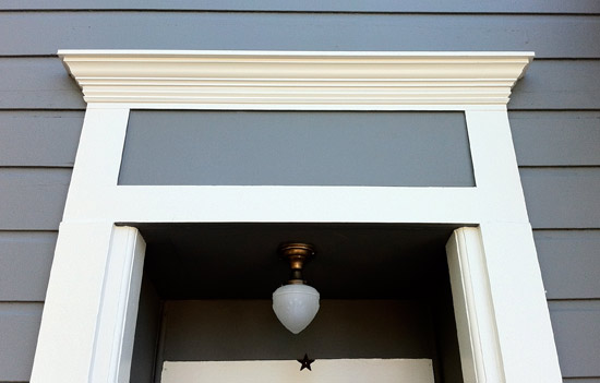
With the kitchen creeping towards completion (but not finished yet), my mind has moved to the exterior of the house. We did a bunch of work on the outside to take it from horrid to okay, but it’s still plain. I spoke to a neighbor who remembered meeting a visitor who grew up here and them commenting how they remembered gingerbread on it. Gingerbread can mean many things to many people, and I’m not kidding myself that the direction we’re going with the outside is historically accurate. But we’re taking some cues from the moldings that remain and I have plans to bring back some of the old style.
I’m starting with the area you see above. I call it a transom, even though I don’t know that there was actually ever a transom window there. My plan is to make a scroll-cut panel that will lay in the gray rectangle. Pictured below is the only remaining corbel on our house, and aside from window casings, it’s all we’ve got to go on.
I think our house probably qualifies as a Folk Victorian: a simple, mostly symmetrical residence that used some of the ornament that was starting to become available, but wasn’t built as a showcase for it like a Queen Anne. I poked around our neighborhood and though I’ve never found a duplicate of our house, I looked at some of the millwork on the older houses and got some ideas about what the ornament may have looked like, and what the tools of the time could produce (Our house is either 1890 or 1896, and it was one of the first in the area).
These appeared to be the oldest houses around that were still intact. Lacy, scallopy trim with an occasional scrolly corbel or bracket. Clapboard siding, not shingles.
These look more like the San Francisco vics I grew up with. A little more ornate, level upon level of woodwork (the gold balls atop the stars), and scalloped shingles mixing with the clapboard.
This however, is in many ways the most like our house:
Even down to the god-forsaken awning. Simple casings, symmetrical roof, plain clapboard. Fancy on the roofline though. Like I said, I’m not looking to make a historical reproduction. I just want the house to fit in with the other houses of the era, working with our budget and our aesthetics.
I have no skills with a scroll saw or a jigsaw or a lathe, but I do know my way around computer-aided design and we in the Bay Area are super lucky to have a place called TechShop. You pay for membership, take some safety classes, and then get access to extremely modern tools like laser cutters and 3D printers. Remember the house numbers? Those were laser cut via mail order, but soon I’ll be able to operate a cutter myself. I get gleeful with the possibilities!
So anyway, that transom panel. Taking inspiration from what we’ve seen, I mocked these three designs up:
I like aspects of each of them, but none were exactly what we wanted. I talked to Randall about which aspects we liked and came up with this:
It’s not final. I can never stop messing with designs til the last minute. But it’s simpler, and I think it should be. But I’m sure I’ll also cut a flower center like the one at the top, just in case we don’t like the disk/orb. Disclaimer: It may be a little while til I actually get to cutting – our part-time son Max is here for the summer, and well, I have priorities.
What do you think about the design? How would you dress up a simple house?


